Midnite Collective interviews Mike Lawrence, Illustrator
First off, thanks for your time in making this interview happen. It’s great to be able to get inside your head to see what makes you tick! Your ideas are so interesting in taking classic themes and aesthetics like death, gore, psychedelia, architecture, demons, and mysticism and applying a completely fresh, invigorating perspective on them.
Initially, where and how do you find inspiration for your concepts? And when they come to you, how do you begin to flesh them out into a cohesive story or piece?
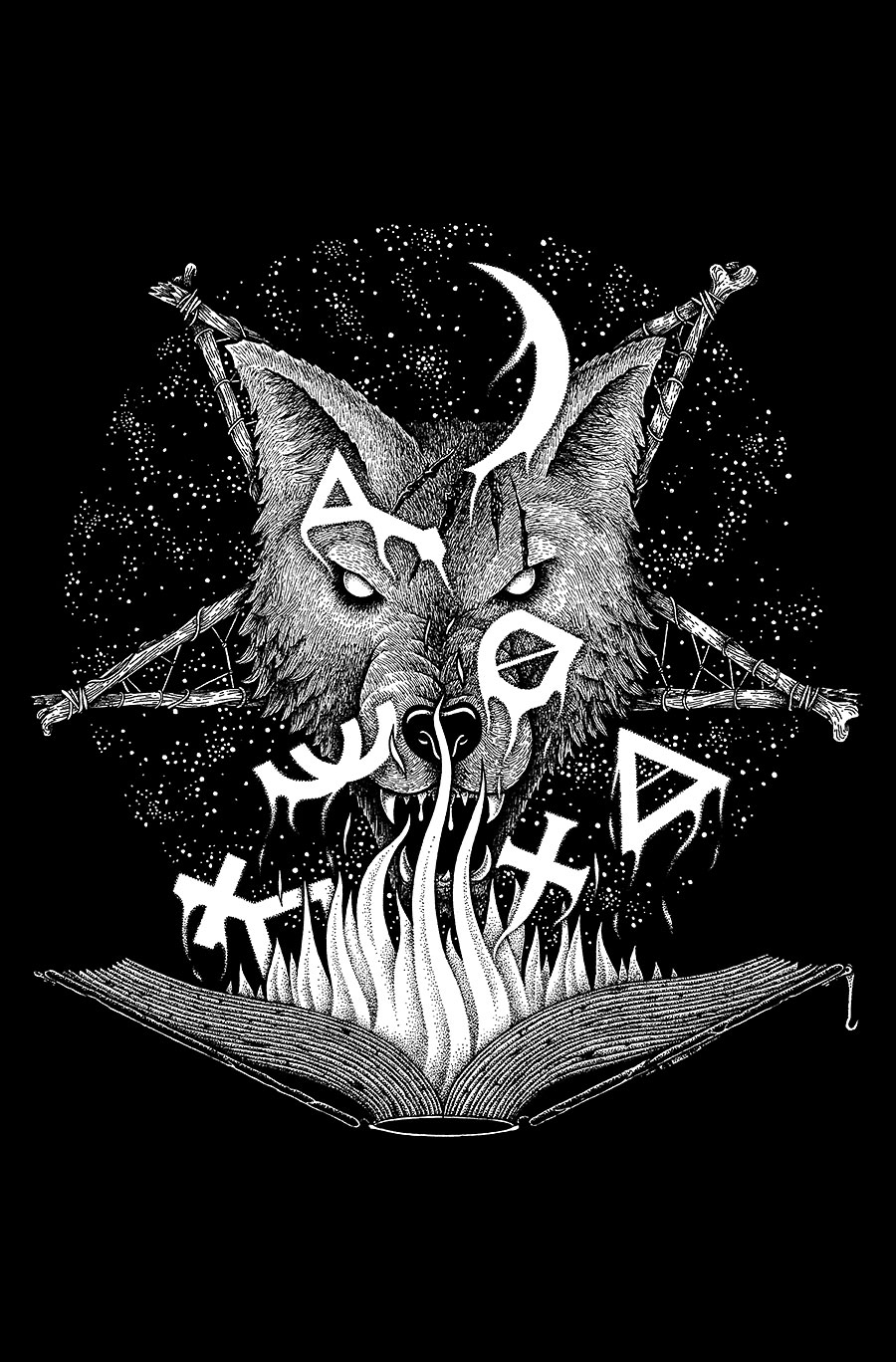
It depends, a lot of times a client will come to me with a pretty clear concept in mind, and it’s up to me to turn it into a good image. Unless the concept is shit, which happens, then I try and lead them in a different direction if possible. But in general, my ideas come from a variety of sources, music, movies, other art and books probably plant most of the seeds in my mind, but I can’t always tell where it comes from. When I have an idea in mind, the first thing I generally do is write down a bunch of keywords, almost describing the image and trying to think of elements I’d like to include in the image. From there, I do however many thumbnail sketches are necessary to get a good idea fleshed out. Then it’s onto the full size pencil drawing, then inking.
Your style seems to really find a lot of detail in it… so many fine lines and dots! That much attention and refinement must take a ton of time. On average, how long would you spend on a piece?
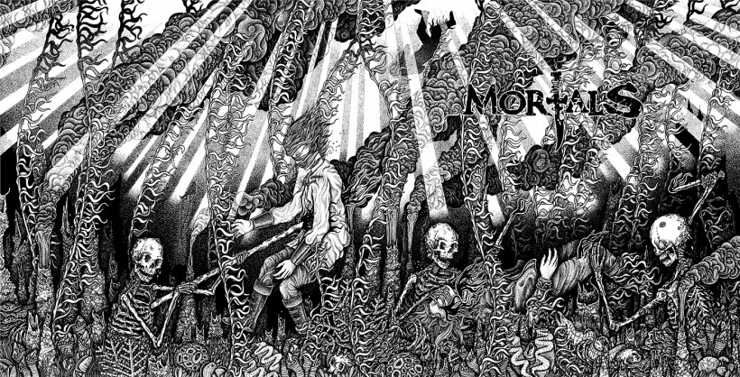
It depends, some take longer than others, but an average shirt design probably takes 15-20 hours from start to finish. I spent over 3 weeks on the most recent Mortals album cover, that was painstaking and it would take a lot to get me to do something of that magnitude again.
I’ve learned that you privately screen all of your work on your own, in your studio. What drew you to silkscreening your work? How did you come to want to not only want to illustrate your pieces, but take on the responsibility of printing them as well?
I’ve always loved printmaking; my mother is a printmaker, so I grew up surrounded by it. When I saw how cool larger silkscreen posters looked I really wanted to print some, but it’s an expensive investment when printing through a professional shop. So I decided to rather make an investment into silkscreening equipment of my own. At times printing can be a pain but for the most part I enjoy it.
Now, not only do you make great pieces of graphic, illustrative nature.. but you have done a multitude of logos and hand-lettering projects as well. Most of your band illustrations, even, you include your own hand-crafted logo (even if loosely based on their already established logotype). Is there a specific reason
you usually include a hand-crafted logo or lettering in your designs? Where do you extract your interest and inspiration from in letters?
I love working with letters and calligraphy, that’s why I generally include it with a band’s artwork. It’s always a challenge to have another take on a band’s logo and integrate it smoothly into the illustration. It’s even better when they are not necessarily concerned with me using their logo, it gives more freedom overall!
A lot of your work is reminiscent of old 80’s-90’s B-movies and their themes / style but with your take on it. What are your favorite slasher or horror flicks?
The Toxic Avenger, The Stuff, Re-Animator, Class of Nuke ’em High, Humanoids From The Deep, Zombie Lake - to name a few.
You seem to get a lot of inspiration from motorcycle culture, too. You have many pieces with bikes, bikers, or their themes. What is your ultimate dream bike?
Sadly, I have never owned a bike myself. I have always wanted to and intend to, but my bank account doesn’t always line up with my wants. I want to get an older bike, like a Kawasaki K750 or something similar, and strip it down and turn it into something of my own. For now, the closest thing I have are meticulous drawings of bikes and gore!
In one departing statement of wisdom for aspiring artists, what would you like to say?
Persistence is key, shit doesn’t always happen on the first try.
Eternal gratitude to Mike for taking time away from his ink and parchment. We are always eager to see what he shares next as he never stops working and continually improves and inspire with his illustrative spawnings. For more of Mike’s creations, reproductions, and thoughts, visit www.mikelawrenceillustration.com
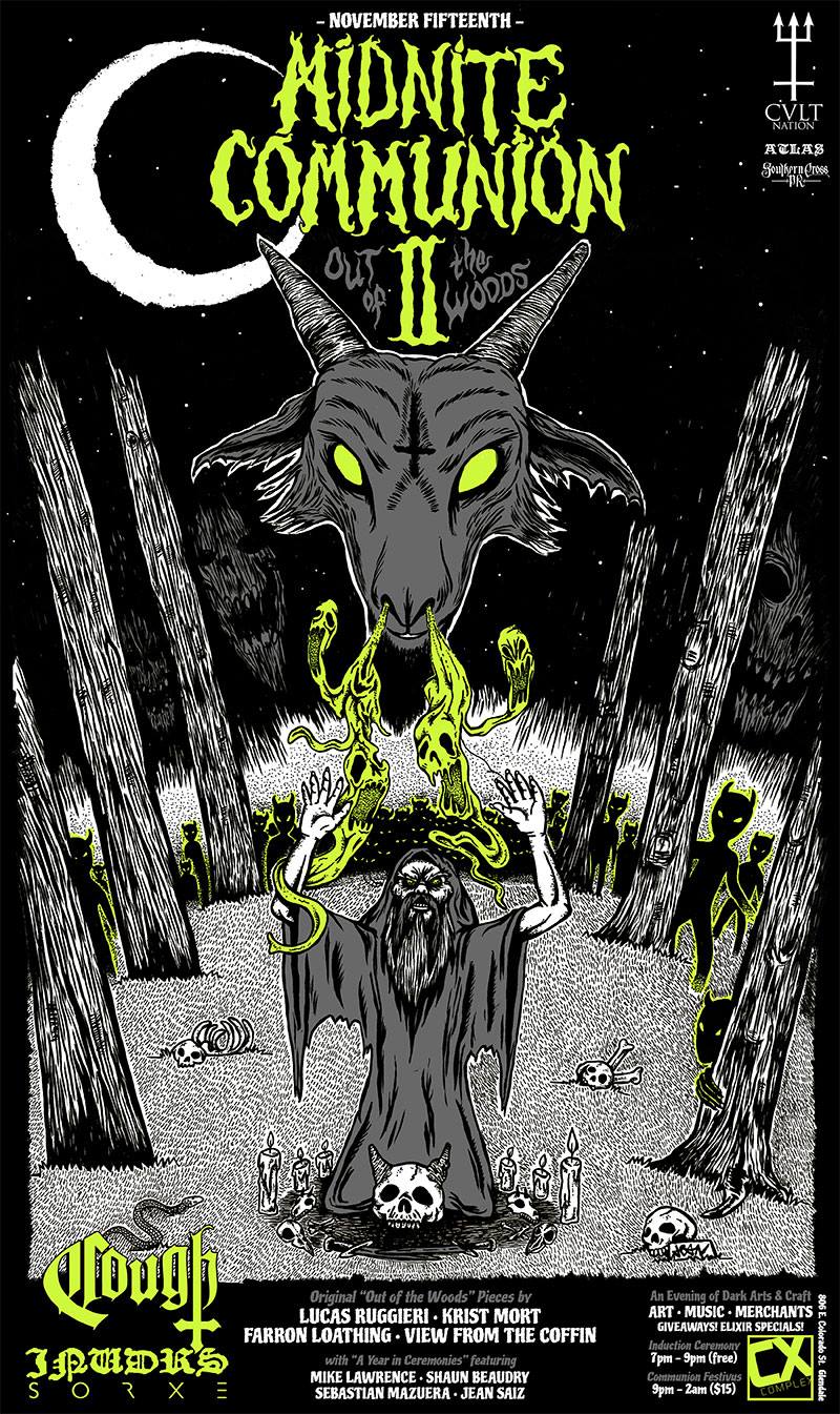
ALSO check out midnitecollective.com for more info about MIDNIGHT COMMUNION II on Nov. 15th, 2014!
