Music and its packaging share an odd relationship. As a teenager in the 90’s, I grew up taking an album’s packaging for granted – it was something to attract my attention in the store and help signify an album’s mood or genre when I made a purchase. It was something to hold and read and think about while I listened, or maybe store in a box when I put the CD in a giant portable binder. Pre-streaming, regardless of what one did with it, a piece of music’s physical packaging was intertwined with the whole process of consuming music. Now, of course, the relationship has changed. These days you either encounter it because you purchased the music physically, or you do not because you stream. Which means whatever an artist or label has decided to do regarding a piece of music’s physicality is no longer an essential part of the overall experience; it’s an optional part. All those decisions about about layout, lyric sheet, how to convey track titles, colors of the actual piece of vinyl or artwork on the cd itself have been relegated to extras, which puts a label or artist in an interesting position: if you are going to convince someone to pay more for something, what should that something be? The people who buy physical copies of music WANT more than just the music – they place a premium on all that extra stuff. So how do you meet those expectations? For some, it’s simply a matter of just offering a physical thing at all; the exclusivity of a limited tape or piece of vinyl can sell itself. For others, the packaging is an art form itself: creating a physicality for a piece of music that does justice to what the music itself is going for. Which brings us to the new Uprising tape from Tridroid Records.
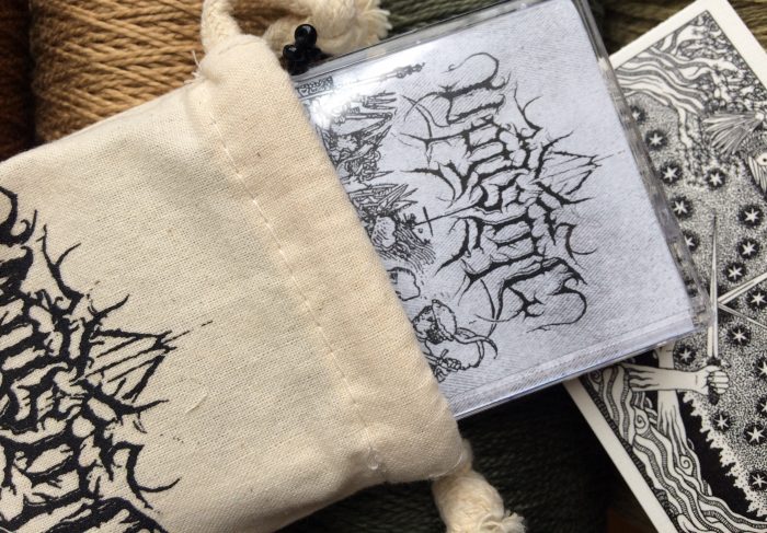
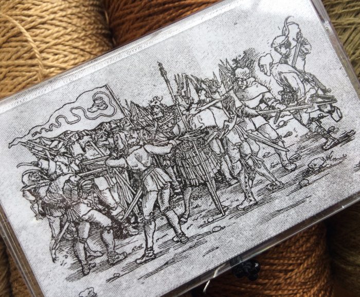
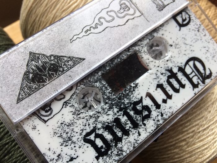
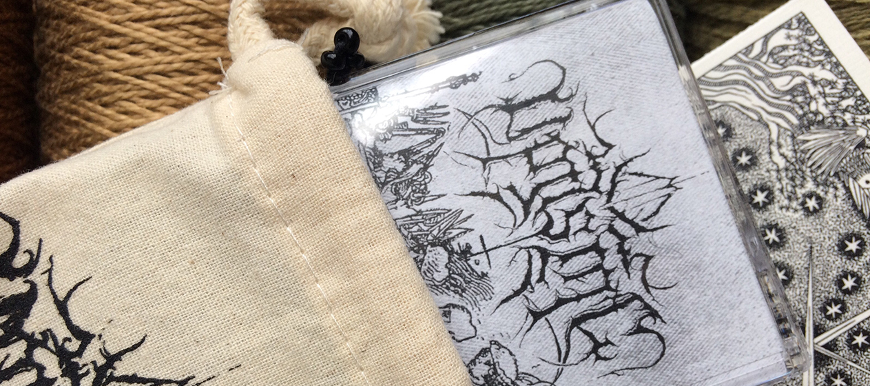
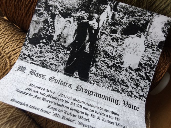
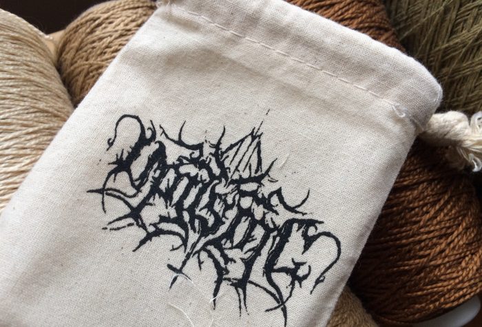
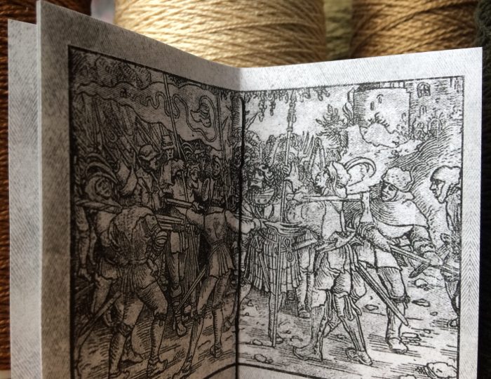
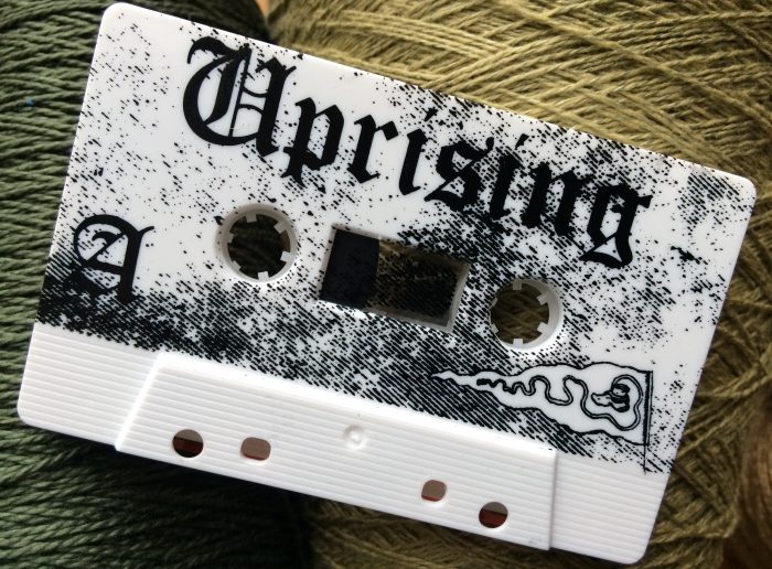
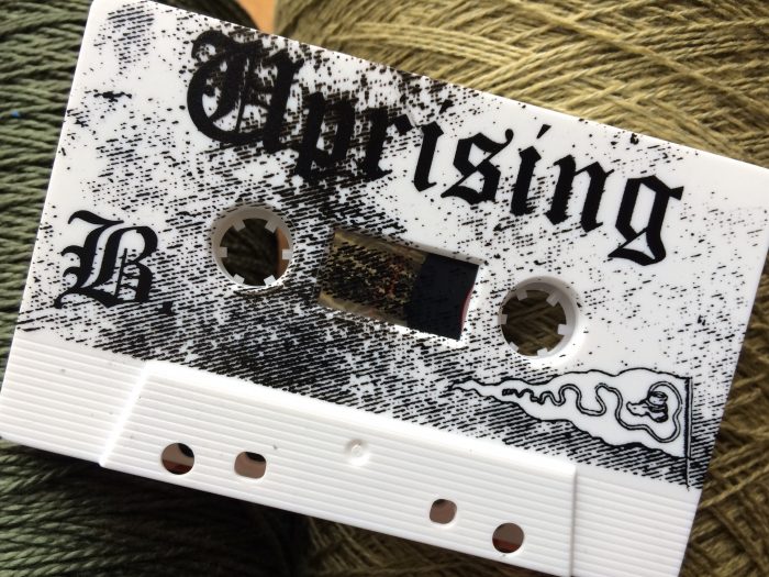
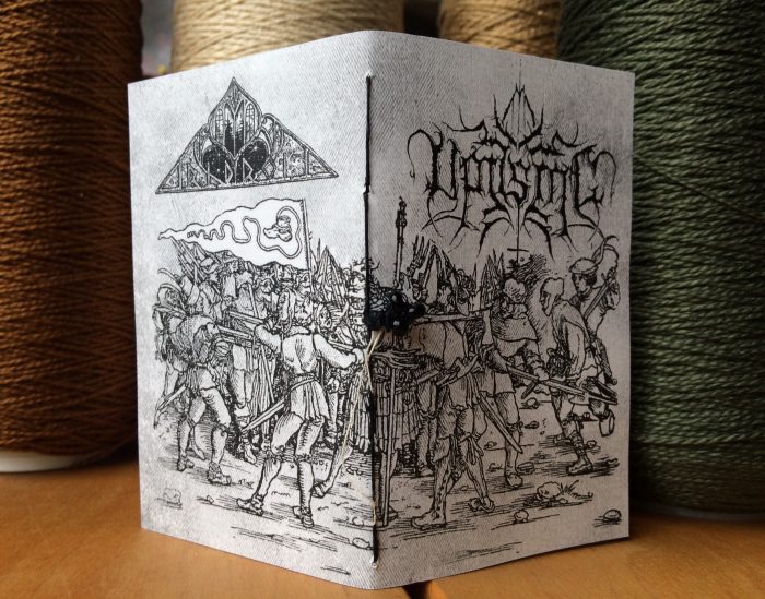
The Uprising album has been out for a while now; Wolfsgrimm Records put the CD out last March. But for tapeheads, this edition is a must-have. With this tape, Tridroid has raised the bar for how a cassette can be packaged – it’s a thing of beauty to behold and compliments the music perfectly. The album itself is a violent black metal call-to-arms; it doesn’t sit still, but has been crafted with care and precision without losing the scrabble and blood-thirstiness of an armed militia. The packaging of Tridroid’s tape edition honors this spirit; the artwork brought over from the CD has transitioned to the tape format in a sensible way, and the additional artwork maintains the spirit (even though separate artists were involved). The burlap bag lends it an old-world charm that compliments the woodcut-esque cover, and the massive booklet is hand-stitched and actually worth your time to peruse and read. Perhaps most noteworthy, the actual tape has an all-over screenprint on both sides which distinguishes it immediately, and it’s cool to see that there are still ways to push the boundary of how to design a plastic cassette. Overall, it’s evident that this was all made by people with a passion for what they do, and that is certainly true of Christine Kelly at Tridroid: she’s a fan first, and runs her label as such. She was kind enough to answer my questions about her thoughts on album art in general and putting this project together.
What made you want to go all out for this particular album?
The artist is a good friend of mine and gifted me with a copy of the cd for my birthday while I was visiting him. I gave it a listen, and every track was so excellent and reminded me of when black metal was full of riffs and extremity. I tend to listen to albums front to back, and when an entire album blows me away, I want to put it out. More than that, I wanted to do it justice. The art that went with [it] fit perfectly with the sound, so I wanted to make sure I was able to include it. My designer, Joe Beres (from small doses recordings in Minneapolis), is also a friend of the artist and went above and beyond to make sure the design included all the artistic elements from the cd. Basically, we label people are just big ol’ fans and wanted to “make it real nice.”
As a music fan, how much is packaging tied to the overall experience for you?
So. Much. Extreme music, for me, isn’t just about the sound, it’s very much an aesthetic (and I imagine a lot of fans feel that way). I like unpacking things, looking through booklets, oohing-and-ahhing at colored vinyl… the whole deal. One thing I’m a big stickler on, though, is making sure it still fits on a shelf. With this one, I took special care to make the full package a LOT, but also fit right next to any other cassette.
I appreciate that; a lot of us are pretty OCD about displaying. So did you design this with yourself as the audience and just went all out, or were you thinking about an average tapehead customer and what someone would be willing to pay? How do you balance cost with “wildest dreams” when it comes to packaging?
I figure I’m right up there with the average tapehead consumer (which is why I’m a stickler about things being the same size: my collection has outgrown my shelves by far), so I basically designed it for me. It was also great because it showed what was possible with special packaging taking into account the cost, the size, and the format. With regard to cost, the bells and whistles weren’t TOO extreme in cost – the thing that I’d have to give more thought to in the future is the time involved in putting it all together. Just the time involved in getting designs to the screenprinter, the digital printer, the cassette printer, hand-stitching every 16-page booklet, getting a hand-drawn design ready for printing… these are all things you don’t think about being time-consuming until you’re doing every single one for one release, ha.
Who was involved with putting this project together?
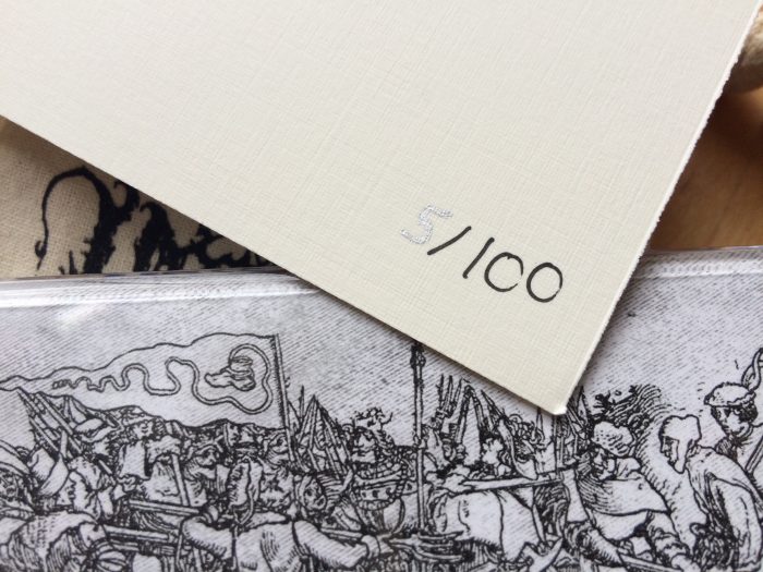
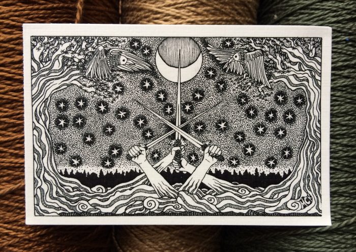
The designer for the original cd [and band logo] was Lukas Wezel (Luk Hass on facebook); Marty Rytkonen at Bindrune screen-printed the pouches; Melissa C. Kelly (my wife), did the original hand-numbered print; Joe Beres designed the j-card, booklet, and all-over cassette print.
Tell me about that all-over tape print – that’s certainly a standout on this. What inspired it and what challenges did it pose?
I saw that duplication.ca had a new shell in stock (matte white) that they said they could experiment with all-over prints for. Then, the Ennoven tape from Graven Earth happened to use those very cassettes (but without the all-over print) and they just looked so killer – I mostly just wanted to see if it would actually work. Joe did an excellent job with the design of it, then the pad printer at duplication.ca kept me in the loop, letting me know when something had to be changed because it wasn’t fitting just right. So it worked!
Do you envision doing more releases with this level of design and extras?
From here on, most releases will come with an exclusive art print and I may do some small-number special editions with the pouches, but maybe not all of the elements together. But if the right thing comes along, I just might!
Can you give us any hints about what’s coming up this year? What are you excited about, both as a label and a fan?
Well I’m pretty psyched about a couple of licensed releases I’m working on – one of them has never been issued on cassette before. Think early Swedish Death metal. With demos. Double cassettes.
And in addition to the already-announced Violet Cold, The Blight, and Ghost Horizon releases, I’ll be putting out the new Void Ritual on cassette and re-issuing a classic Amiensus EP on cd and cassette.
I guess I shouldn’t say classic, it ain’t that old, but it’s a goodie.
Awesome! Thanks for taking the time to answer these.
Always! Thanks for the support \m/ \m/
Purchase this awesome tape (and other excellent metal) from Tridroid here:
http://tridroidrecords.storenvy.com/
Keep up with Tridroid on FB:
https://www.facebook.com/TridroidRecords/
Listen to this killer album here:
https://uprisingblackmetal.bandcamp.com/releases
