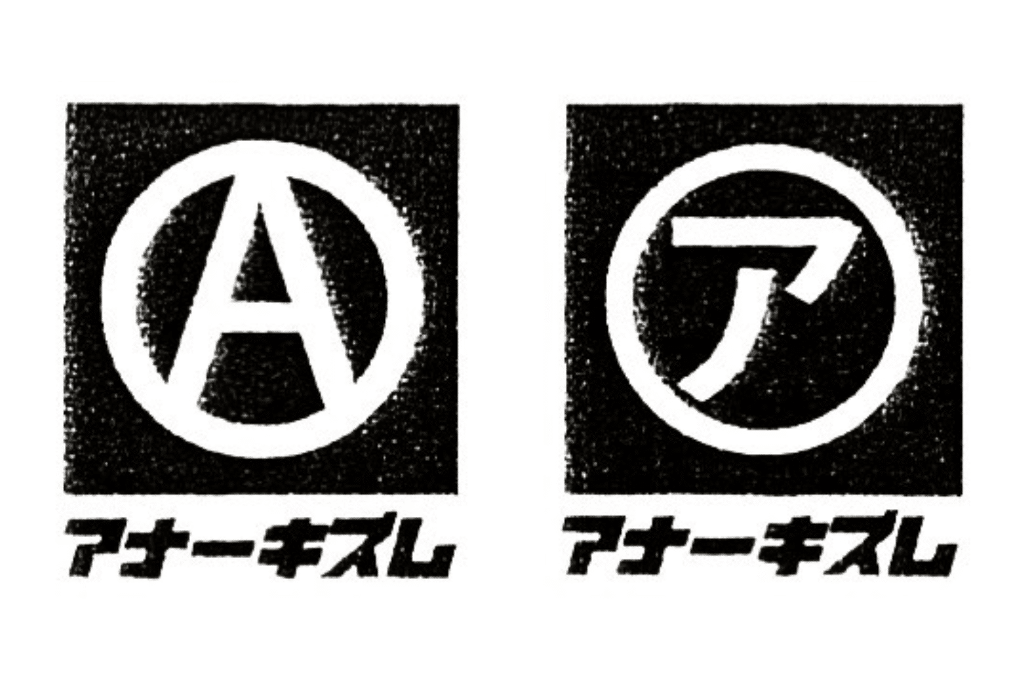
When I first held a SUBHUMANS or Flux Of Pink Indians record in my hand in the early 80s, I didn’t realize how they would change the way I look at art. The images on these records were black & white and visually powerful. When I look at the graphic design work of Dead City Tokyo, it takes me back to the early 80s but also pushes my imagination into the future. Their design work is so simple while still being very complex! The logos that they create for some of my favorite bands or record labels are priceless in my mind. I want to say that their work is Japanese Anarcho Futurism because of the way they are able to balance the past with the future. Dead City Tokyo’s design style is timeless and magical at the same time. Their work screams created by a Punk for Punx! Today I want to give Dead City Tokyo their flower for being one of the raddest graphic artist doing it right and beyond!
80s Hardcore
Give Them Their Black Roses!
The Japanese Anarcho Futurism Design work of DEAD CITY TOKYO


You May Also Like

Bizarre
Before I ever set foot in Japan, I was fascinated by its history and culture. One thing that I found disturbing early on was...
Dis-beat
Discharge created D-Beat, but Japan’s DISCLOSE took the genre to another level! Check out these three insanely killer full sets from DISCLOSE!


Art
Public bathrooms sometimes remind me of Pre-Historic caves because of the way humans love to to leave their mark behind with graffiti, stickers or...

Cvlture
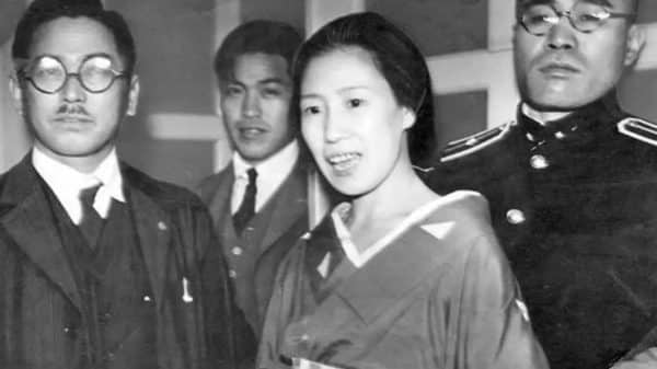
Text via Providentia / Romeo Vitelli On May 18, 1936, Sada Abe strangled her lover, Kichizo Ishida, to death. After laying with the body...