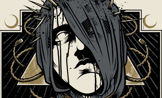
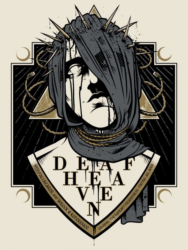
Creating a good show poster is an art unto itself. Being able to capture the mood of the event, as well as the viewer’s eye in an instant, is incredibly difficult. There are so many factors to consider: shape, layout, colors, font, not to mention the content of the image itself. TFK! Illustration aka Mike Wohlberg shows us the work put into the awesome poster he did for 6/09/2014 DEAFHEAVEN // PALLBEARER // WRECK & REFERENCE show in Philadelphia – the layer upon layer of illustration and graphic design that eventually becomes a vivid and collectible piece of artwork for an event loaded with amazing bands. This video demonstrates exactly why we have so much respect for show posters! Check out his time lapse video below…

