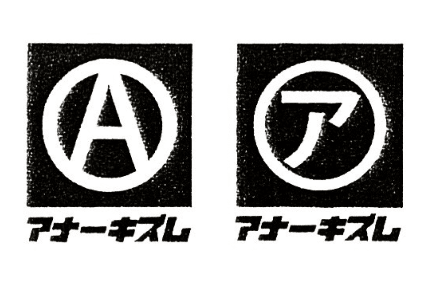
When I first held a SUBHUMANS or Flux Of Pink Indians record in my hand in the early 80s, I didn’t realize how they would change the way I look at art. The images on these records were black & white and visually powerful. When I look at the graphic design work of Dead City Tokyo, it takes me back to the early 80s but also pushes my imagination into the future. Their design work is so simple while still being very complex! The logos that they create for some of my favorite bands or record labels are priceless in my mind. I want to say that their work is Japanese Anarcho Futurism because of the way they are able to balance the past with the future. Dead City Tokyo’s design style is timeless and magical at the same time. Their work screams created by a Punk for Punx! Today I want to give Dead City Tokyo their flower for being one of the raddest graphic artist doing it right and beyond!
80s Hardcore
Give Them Their Black Roses!
The Japanese Anarcho Futurism Design work of DEAD CITY TOKYO

You May Also Like
Hardcore Punk
On April 23rd, 2020, I wrote about an insanely Sick Japanese Hardcore Punk named KLONNS. Now, almost exactly four years later, I get the...

Tattoo
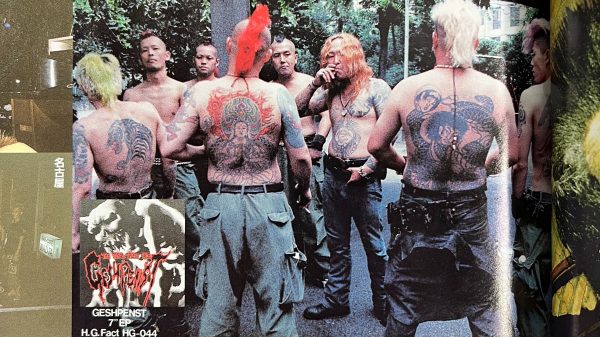
I can’t remember a time in my life when I was not fascinated or inspired by Japanese culture, especially youth culture. I have also...
Art
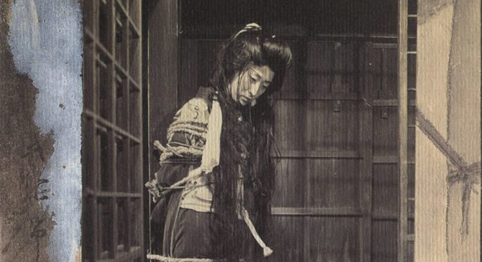
Born 1882, Japan’s Seiu Ito was the Father of “Kinbaku” Art, also known as Bondage Art. His imagination conjured things that many of us could not even...


Documentaries
Now this is freaking intense – we are showing the G.I.S.M documentary called Subj & Egos, Chopped – if you are fan of the...